My friend, known online as Barnaby, brought my name up when J.L. Collins was looking for someone to make the opening credits for a TTRPG AP called Quadrilateral: Frostfall (a Star Wars Actual Play).
This was a new endeavour for me as I knew I wanted to experiment with video, and turned out quite well. Scroll for the story behind the stills!
I haven't started delving into motion graphics so I completed this mimicry of it with simple side entry of the asset timed well with the motion of the footage.
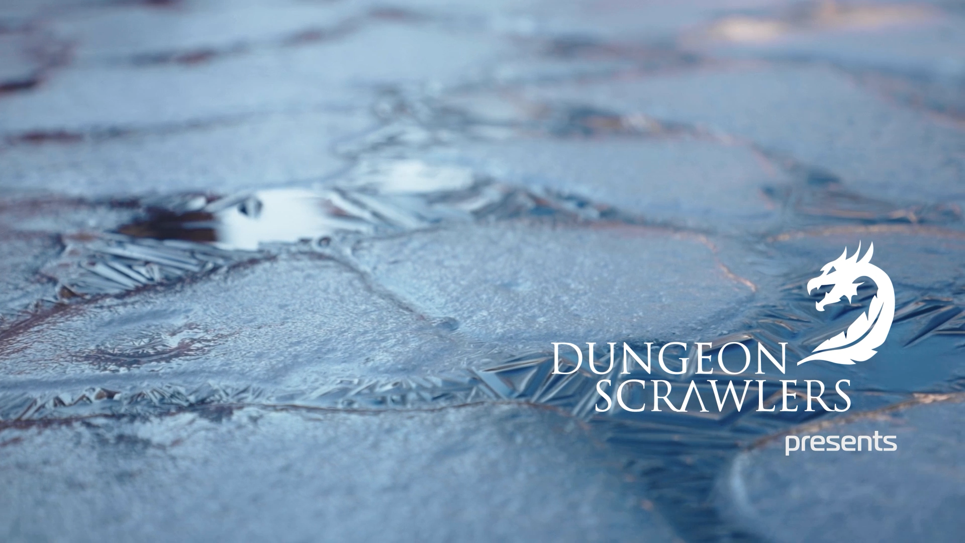
Additionally, I was given the asset of the logo on the left and I edited it to an all white version to go better with the aesthetic and theme of the credits.

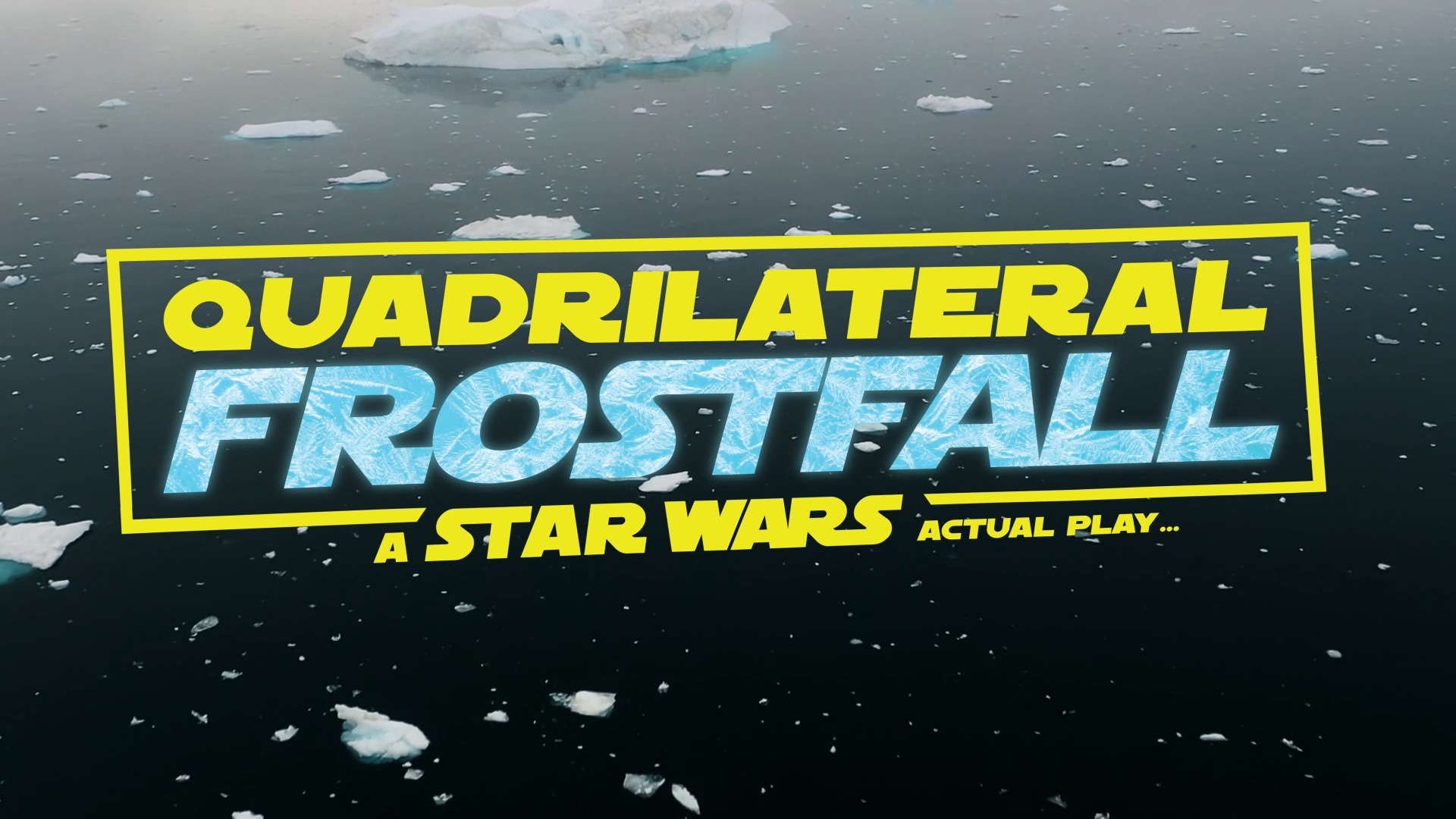
I chose to reverse this footage that was originally approaching the iceberg as the deep icy waters with smatterings of floating ice remind me of the night sky, which was perfect for the title branding to rest on top of. You simply must have space references in a Star Wars actual play.
Logo is not my own and was provided.
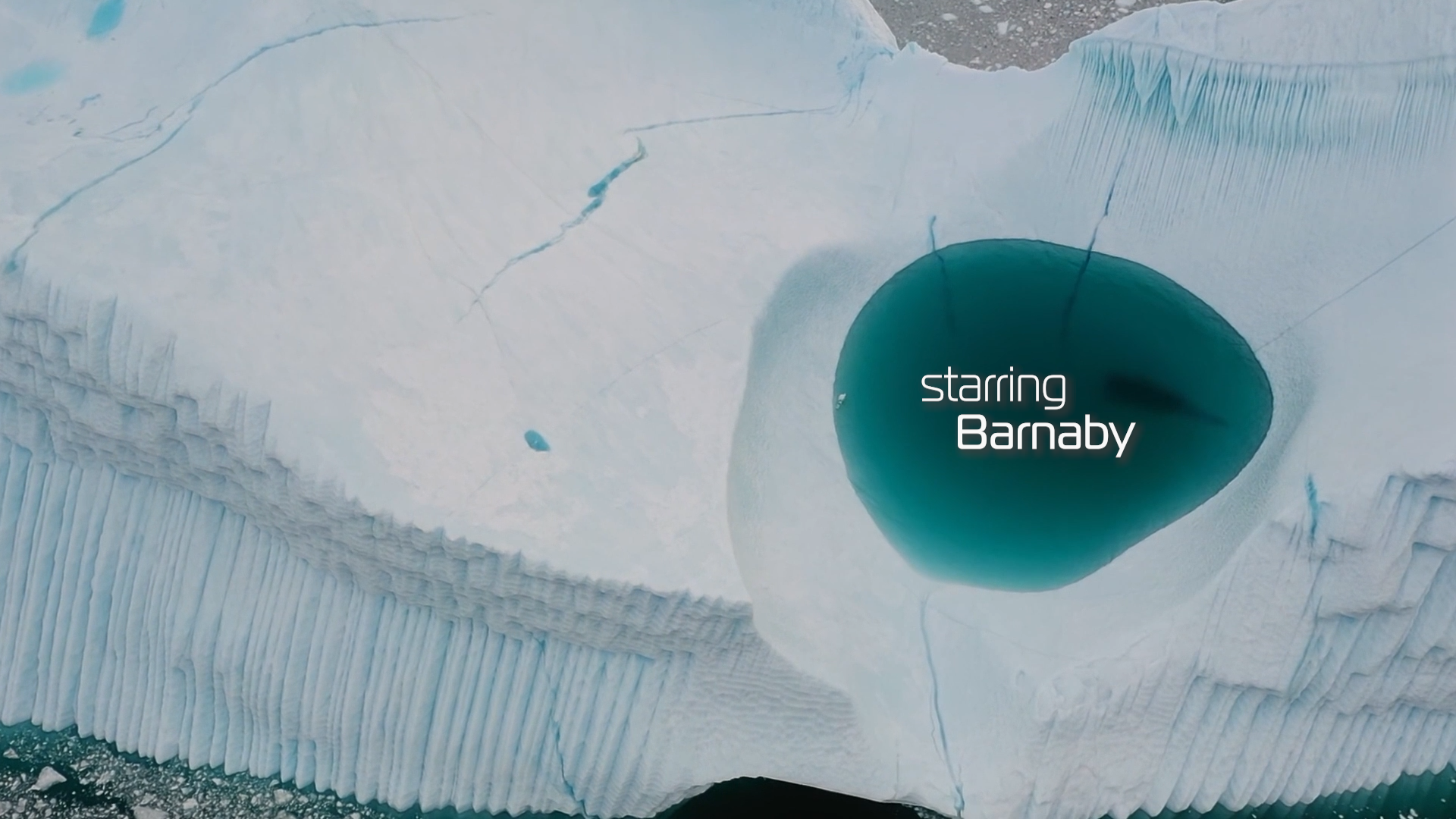
The viewers eye is immediately drawn to this gorgeous pool of water in this glacier, so I put the stars names where they deserved to be: where everyone is looking.
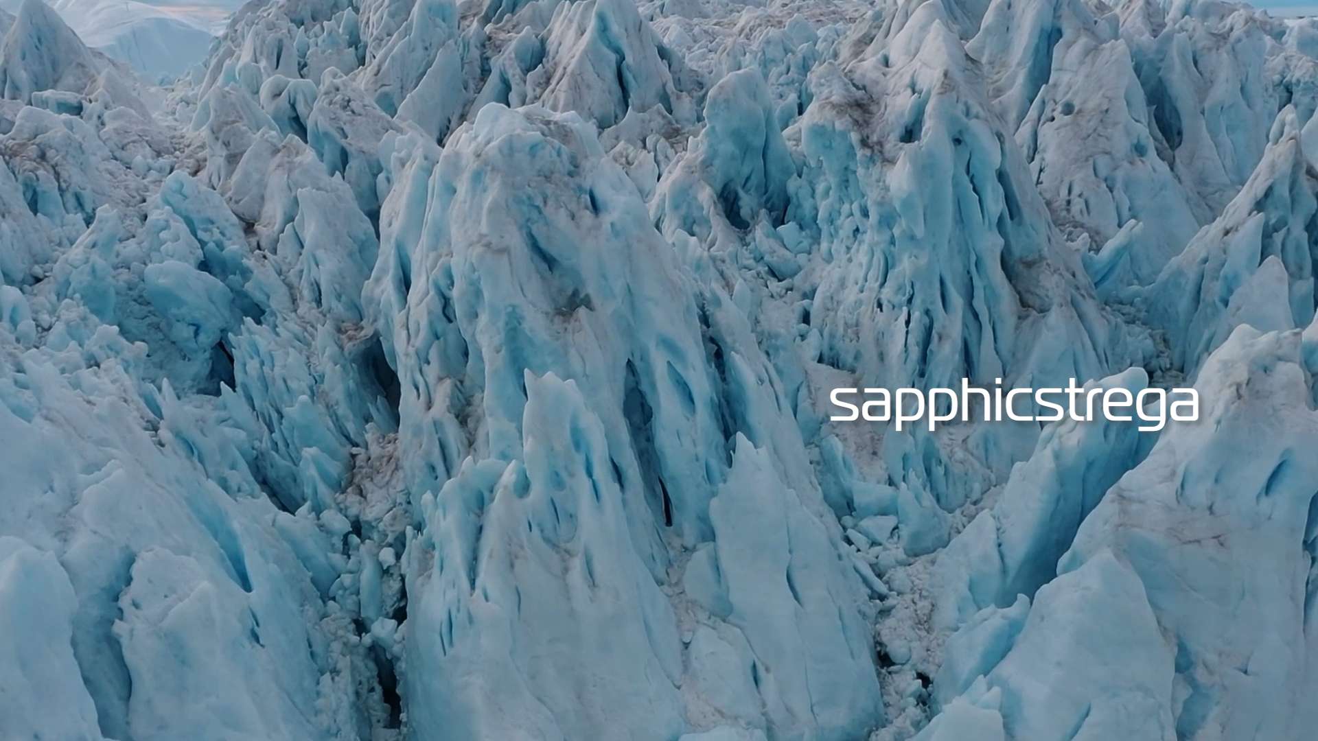
For the sound effects accompanying "maybemaehem" an "sapphicstrega": I made the sound effects pan left to right across listeners ears so when they looked left then right for the text appearing on screen it felt... pleasing.
This is a moment to shoutout J.L. Collins for giving me sounds effects he was holding onto for years to use in this! I use some stock of my own, but it's always rewarding to work with enthusiastic clients in these processes.
I would be lying if I said I wasn't thinking of Twilight with these cinematic shots... but that is besides the point. When I chose the colour of the text I sampled from the dark colours of the river. This footage also shows up when the music gets intense, and I think it pairs well alongside the slight red hue of the flowing water. Reminiscent of blood, perhaps.
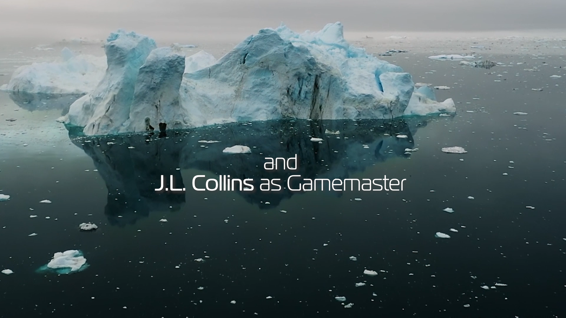
The absence of sounds from the previous scenes made it a bit too quiet so I went ahead and added what sounded like a ship flying overhead to give the footage the feel as if it's the view from the ship.

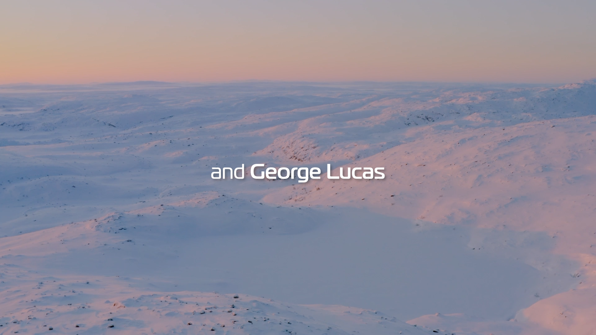
Choosing the font for this was easy. J.L. let me know the vibe he was looking for and Adobe Fonts did not let me down.
I sampled the text colour here from the dark upper right pool of water.
Coming up to the end of the credits, I knew the last scene I had was warmer, so I loved this footage that went cold to warm, left to right.
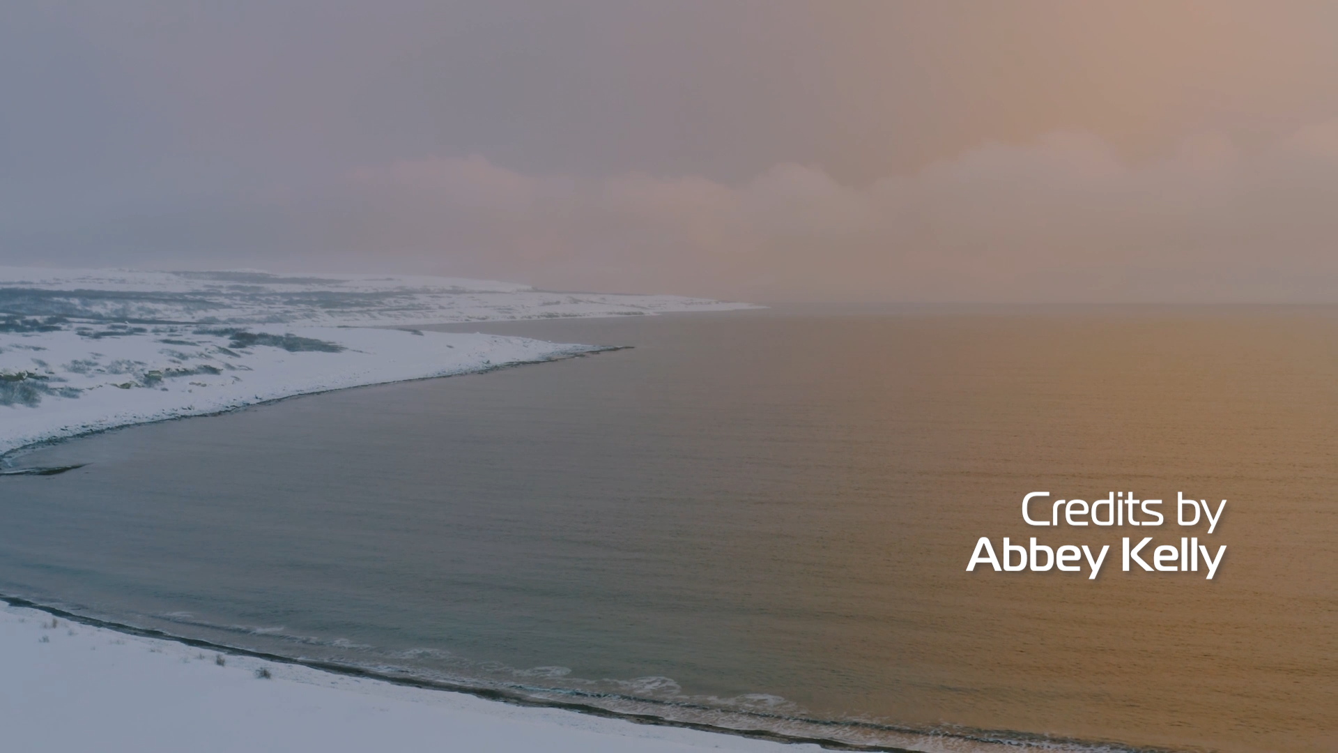
Once again, the ship flying over audio was a fun one to pan, to give more of an immersive audio experience. And finishing on a warmer collection of colours as it fades out is soothing (to me, at least).
Huge thanks to J.L. Collins for the opportunity, Barnaby for the rec, and Pexels for the stock footage. I made sure to credit the amazing stock videographers because I felt lucky to use these beautiful shots.